In the last few years jquery image sliders and jQuery image galleries become very popular in blogs and especially in portfolio sites.One of the easiest solution to attract your visitors and to show your potential clients your portfolio is the image sliders and image galleries.
Today we bring together jQuery image sliders and galleries which are released in the last few months or updated recently.
More Image Sliders and Galleries With jQuery
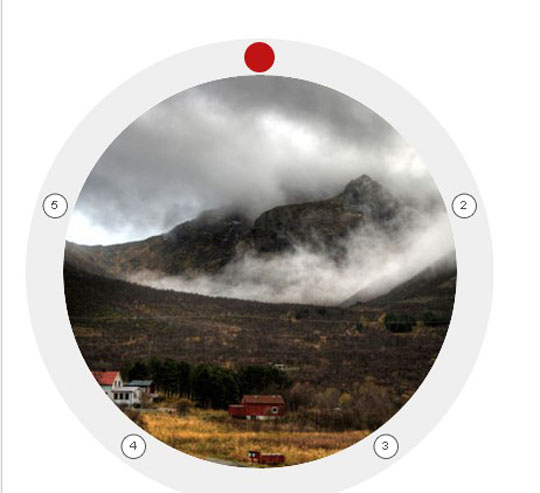
Circular Image Galleries With jQuery
Display your images or items around a shape like a circle or an ellipse.
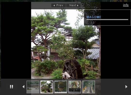
JQuery Image Gallery with Captions and Auto Play/Pause Rotation
An awesome jquery gallery which is transparent, fixed on screen, autoplay on/off buttons and css3 stylized gallery.
JQuery Based Flipped Image Gallery with Bounce Effects
A simple jQuery based flipped image gallery. On hover the images will expand.
Tiny Circle Slider
Tiny Circleslider is a circular slider / carousel.Tiny Circleslider can blend in on any web page.
Awesome Scrolling Navigation using jQuery
The main thing flipboard do differently is to have the logo and logo background elements move at different animation speeds from each other and the main content
Rotating Image Slideshow w/ CSS3 and jQuery
You can use it to spice up your web sites, product pages and other projects with some CSS3 magic.
A Flickr-powered Slideshow
A jQuery plugin that will make it easy to create slideshows, product guides or presentations from your Flickr photo sets. The plugin will be using Flickr’s APIs and YQL to fetch the photos in the sets, after which it will create the markup of the slideshow and listen for events.
Awesome jQuery Image Gallery Plugin(Thumbox)
Browse the images via mini-gallery.Display images description.Effects for input and output images.Keyboard navigation.Navigation with the mouse wheel.
jbgallery 3.0(Big Multiple Images Slideshow With JQuery)
jbgallery is a UI widget webpage written in javascript on top of the jQuery library.Its function is to show a single big image, multiple images, multiple galleries, slideshows, as a site’s background, in a “dialog” mode or as a common pop-up.
Lightweight Thumbnails Image Gallery
Galleria is a JavaScript image gallery framework built on top of the jQuery library. The aim is to simplify the process of creating professional image galleries for the web and mobile devices
Source:
http://www.queness.com